My Finances

The Problem: Students cannot understand the relationship between their bill and their financial aid.

The Student Information Systems (SIS) Project is Berkeley’s initiative to replace the aging and disparate student systems. The SIS Project needed help merging billing and financial aid into a single, smooth student experience.

Final MyFinances page

User Research

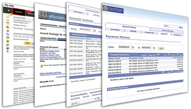
We began by studying the financial web applications of several other universities and explored their layouts of students' financial information.

User Research on other University Billing Platforms

Surveys

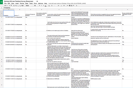
We received 23 responses to an exploratory survey to better understand students' experiences with Cal's financial aid and billing systems.

MyFinances Survey Results

User Interviews

We also conducted several in-depth user interviews by having students walk us through the process of paying their bill and understanding their financial aid.

MyFinances Survey Results

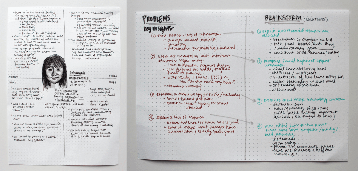
Personas we created to reflect the students we interviewed

Key Insights & Ideation

  1. Students feel they cannot trust the system because it lacks specific information about the allocation of financial resources
    • Provide a breakdown of fees and where to go with questions
    • Display information icons next to each charged item so students know what each charge covers
    • Stay consistent with color coding across the platform
  2. Students are not directly presented with the most important information
    • Add a checklist with tasks that students must complete
    • Display visuals on how student loads and financial aid affect billing
    • Provide disclaimers before potentially risky actions (ex: taking out loans)
  3. Students sometimes find the terminology confusing or misleading
    • Display information icons beside each item with definitions and instructions
    • Create a page for "Understanding your bill" containing an index of terms
  4. Students are frustrated with the systems lack of response
    • Display a banner that clearly states a payment is being processed after one has been paid
    • Place visual cues to indicate when actions have been finalized (such as graying out an option)
    • Create an online discussion where students for students to ask and answer questions

Prototyping

We used small multiples to help us design different layouts. We used a combination of user testing and our own discretion to narrow our selection of possible layouts.

Indiegogo profiles on usertesting.com

Final Deliverables

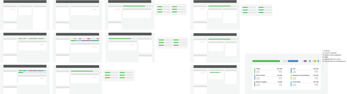
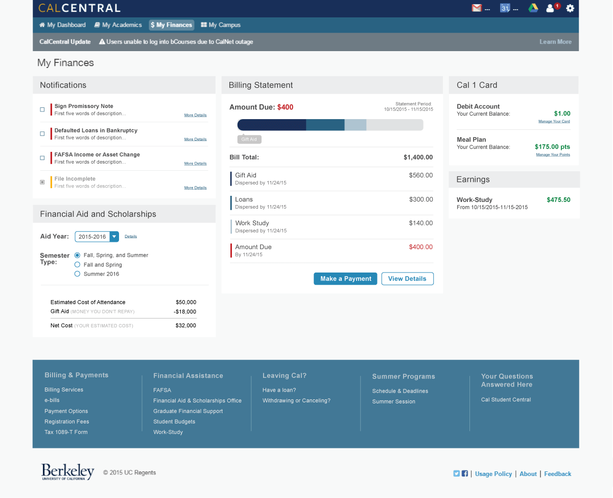
Some notable design features include:

  • Having amount due, the most important piece of information, displayed at the top
  • Representing the relationship between financial aid and the monthly bill with a progress bar. Different segments on the bar show how much of the bill has been covered by existing aid, scholarships, or loans, and how much is left to be paid
  • Maintaining the colors of each category to the descriptions in the form of a bar on the side
  • Having a more descriptive notifications section
  • Offering a detailed description of the bill should students have any questions
  • Placing the "Frequently Asked Questions" in the footer rather than allowing it to take up its own column
Indiegogo High Fidelity